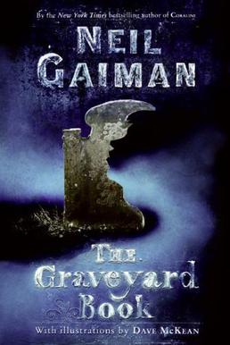
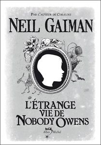
31.10.13

Project 4: Influences and Synopsis

Synopsis:
It takes a graveyard to raise a child.
Nobody Owens, known as Bod, is a normal boy. He would be completely normal if he didn't live in a graveyard, being raised by ghosts, with a guardian who belongs to neither the world of the living nor the dead. There are adventures in the graveyard for a boy—an ancient Indigo Man, a gateway to the abandoned city of ghouls, the strange and terrible Sleer. But if Bod leaves the graveyard, he will be in danger from the man Jack—who has already killed Bod's family.


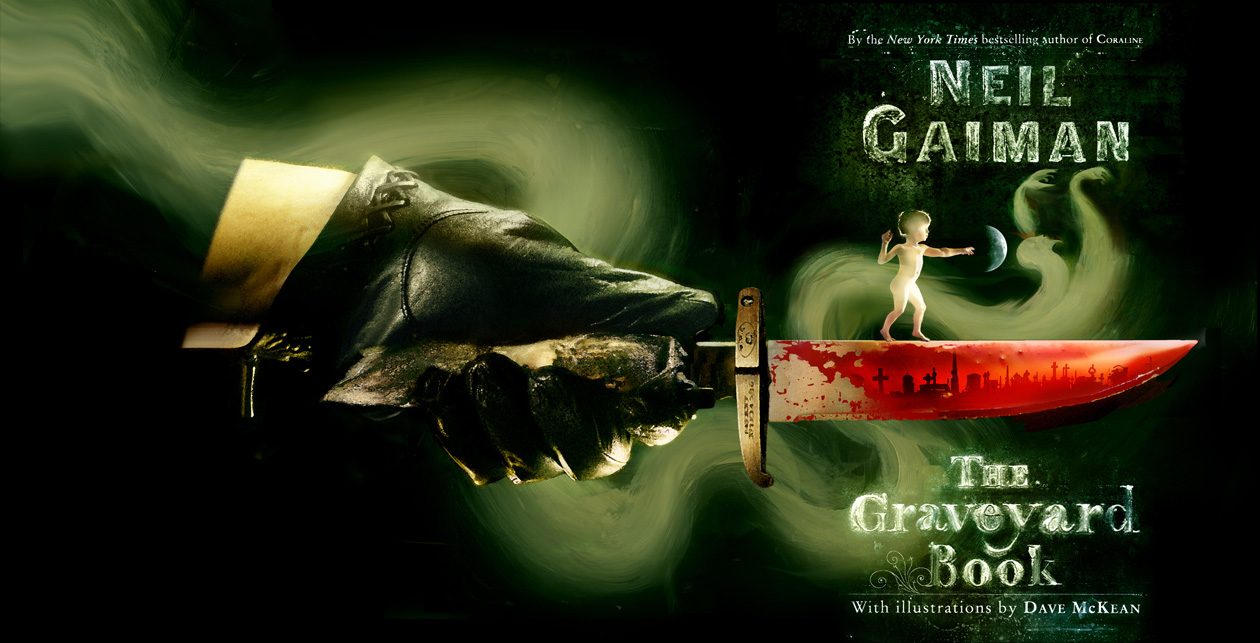
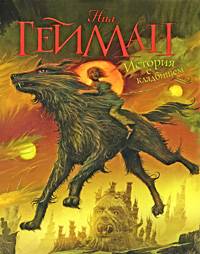
I've been poking around the internet, looking at what other people have done, and I've come across some lovely things! Photos, sketches, paper cutouts...


I'm trying to decide what scene I want to focus on as the cover art. There are so many pivotal moments that people have captured, but there are also these tiny moments in the book that I enjoy, like when Bod befriends the witch, or when Silas brings Bod food from town. So many ideas..

30.10.13

Project 4: Book Covers

The book I want to do for the next project is called The Graveyard Book and it's by the wonderful Neil Gaiman. I love all of his works, there isn't a single terrible one; or if there is, he's very good at hiding it.

But The Graveyard Book. It's my favourite one. This is the cover that I've always been used to: 

US version

I did some research, and there a great many of covers! Like the:

UK version


Alternative adult version

Alternative US version

And another


Special Edition version

With pages that have alternative covers in them

Yet, another alternative [I'm not sure if this one is a real cover, though]

Then, we go into international quarters.

Polish version

Italian version

French version

Another French version

Chinese version

Russian version

Lastly, there are the fan-made versions!


It seems I'm not the only one who loves The Graveyard Book. There are a lot of sources and influences for me to look through, which is awesome, and hopefully ideas will start going through my head.


Project 3: Detail

I worked so hard on the details of the band members, but some of it got lost by the textured layer [intentionally]. Still, I was a little sad to let it get covered up. So! Why not upload it without the texture and masks?

Here ya go!


29.10.13

Project 3: Poster Final


As of today, this is the final cut to my poster. I don't feel like it's finished, though, so I want to go back when I have more time and fix some things. For example, The mask cut-out concept didn't work exactly as I planned, so I want to tweak it a little.

Still! I think as an exercise for figuring out how graphic designing works, I feel like I learned a lot.

27.10.13

Project 3: WIP

I've been working non-stop on the posters. It's taking such a long time! I'm trying to get the basic shapes blocked out on all the figures before I go in and do details.


26.10.13

Project 3: Completed Sketches and WIP

The sketches are complete! The background image is the killjoys, and the overlay is the masks. I'm still not sure if I'm going to do just a silhouette of the masks or the entire thing.


 This is currently the WIP. It's going slowly, and I'm getting frustrated, but I'm keeping hope that I can finish this by Sunday night. 


23.10.13

Project 3: Sketches and Progress

These are the sketches that have been helping form my poster. For My Chemical Romance's Killjoy era, each killjoy has their own mask that represents them. In my poster, I want to use the bandits as the background image, and the masks in the foreground. In theory, the members will be in a washed out colour, like sepia, and the masks will be cutouts that will be kind of like a gateway into the true bright colours of the original pictures. 


This is the progress of the poster. At the top, it'll say "MY Chemical Romance: World Contamination Tour" and in the bottom section, below the picture will be the location, date, time, and ticket price.